I was the layout editor for Calvin University's creative journal called Dialogue, for three of my four years at Calvin. It is a journal that is published once a semester and features student artwork in the categories of poetry, prose, visual art, photography, film and music.
Check out Dialogue's social media accounts:

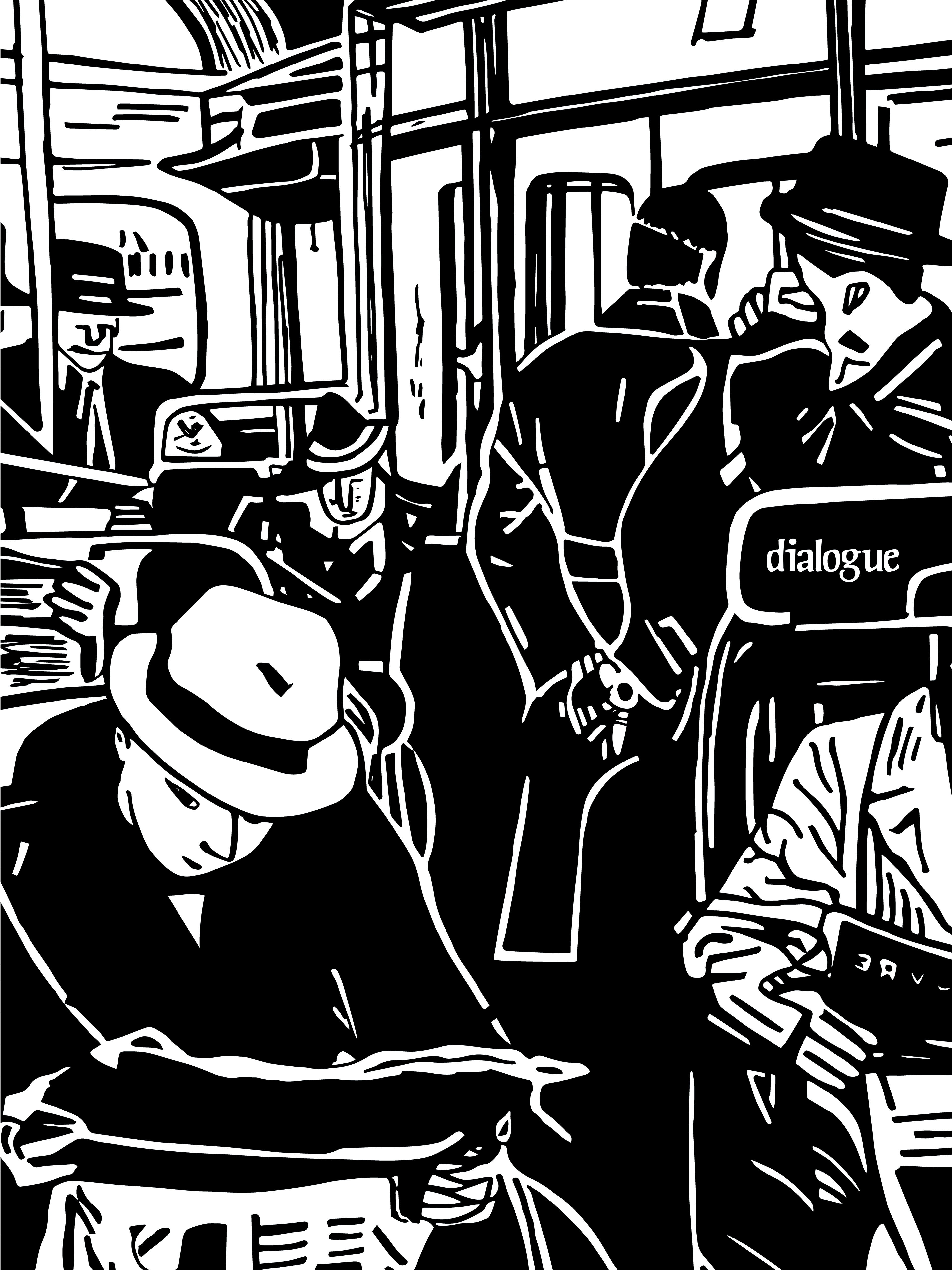

The first year I had full creative control for layout editor, I wanted to respond to some of backlash that Dialogue had received from Calvin's students on campus for being elitist, and highly selective. Past issues were very minimalist and clean, with very few artistic elements accompanying the text and images. So for this issue, (the cover of which features the striking girls on the cover with neon hair), I decided that I wanted the inside to reflect the new leadership and approaches taken to the magazine. Consequently, this issue featured bold, roughened lines, on every page, which reflected more of a relaxed and messy tonality to the student organization than before. It was my way of signaling that everything you expected from Dialogue has been thrown out the window, and change is coming.
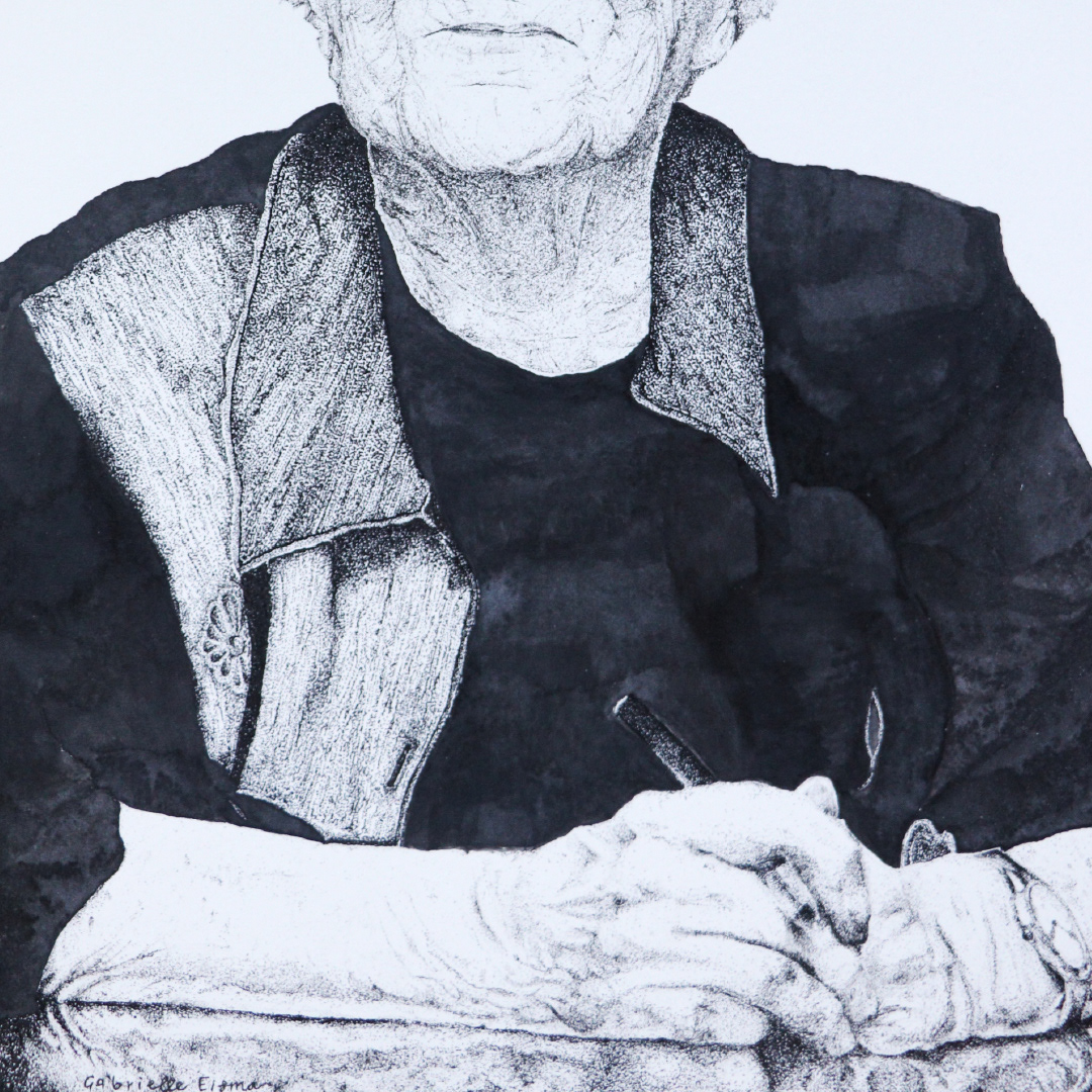
Some spreads from issue 52.1
Due to COVID-19, our issue 52.2 was online. We featured chosen pieves on our instagram account.

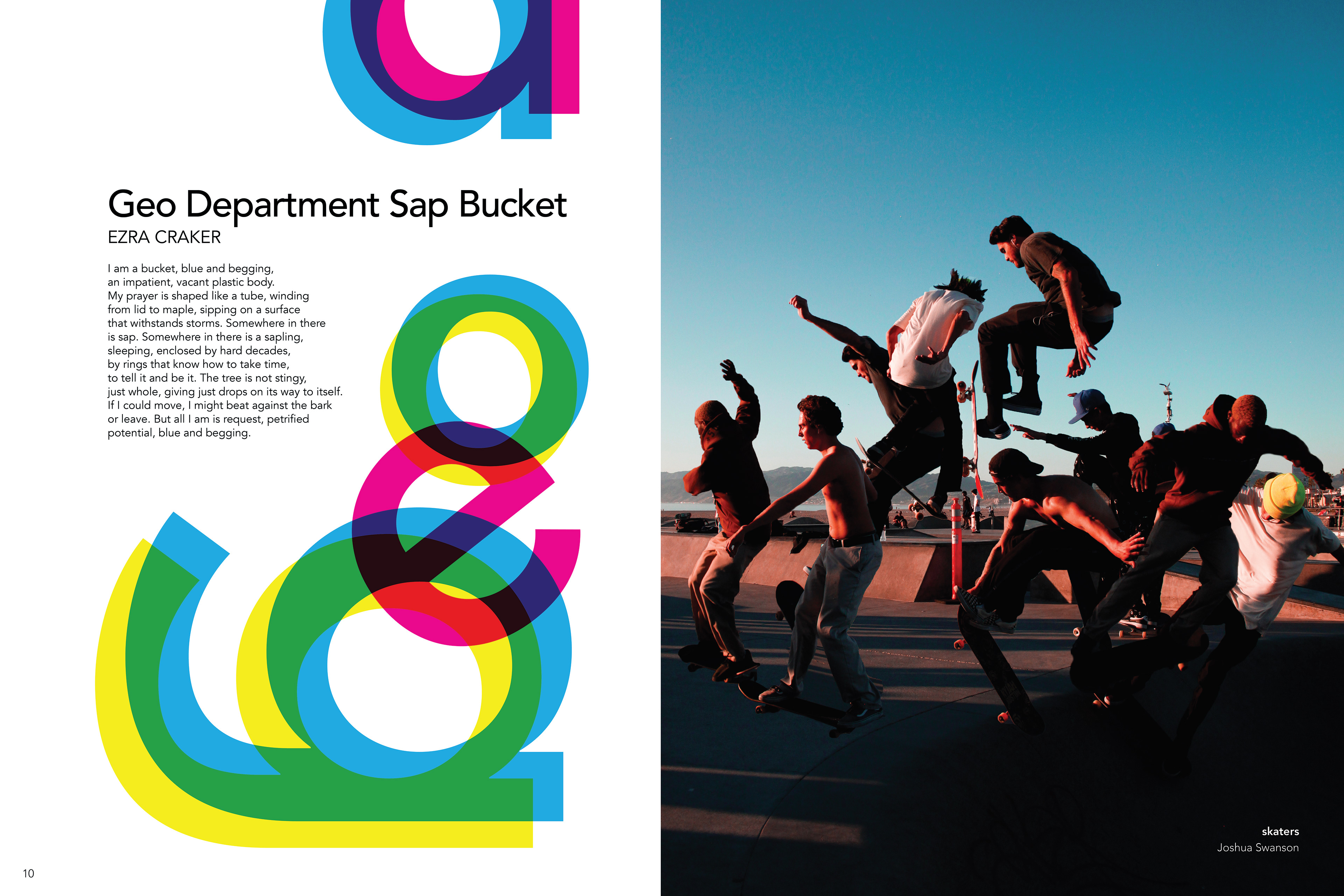
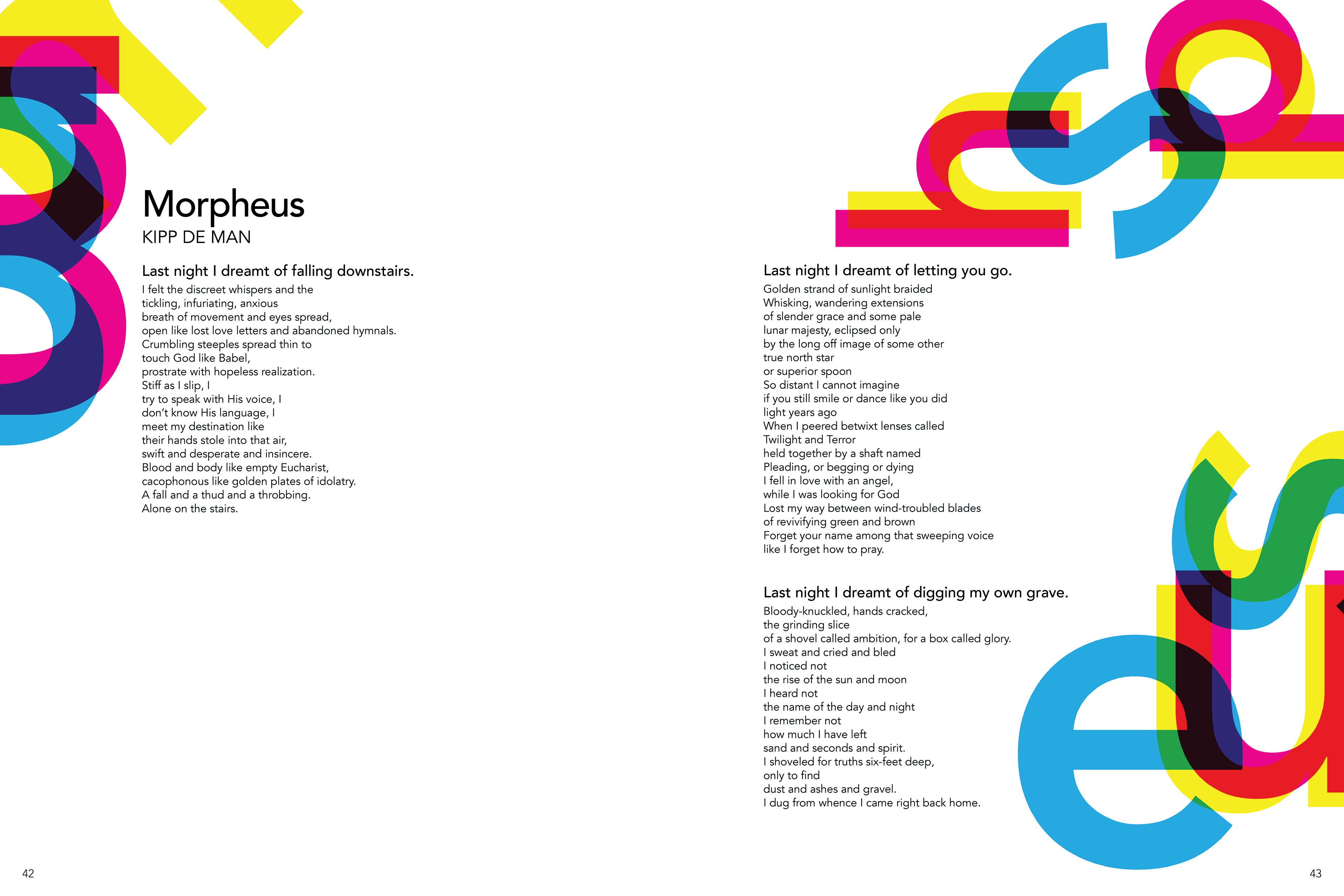
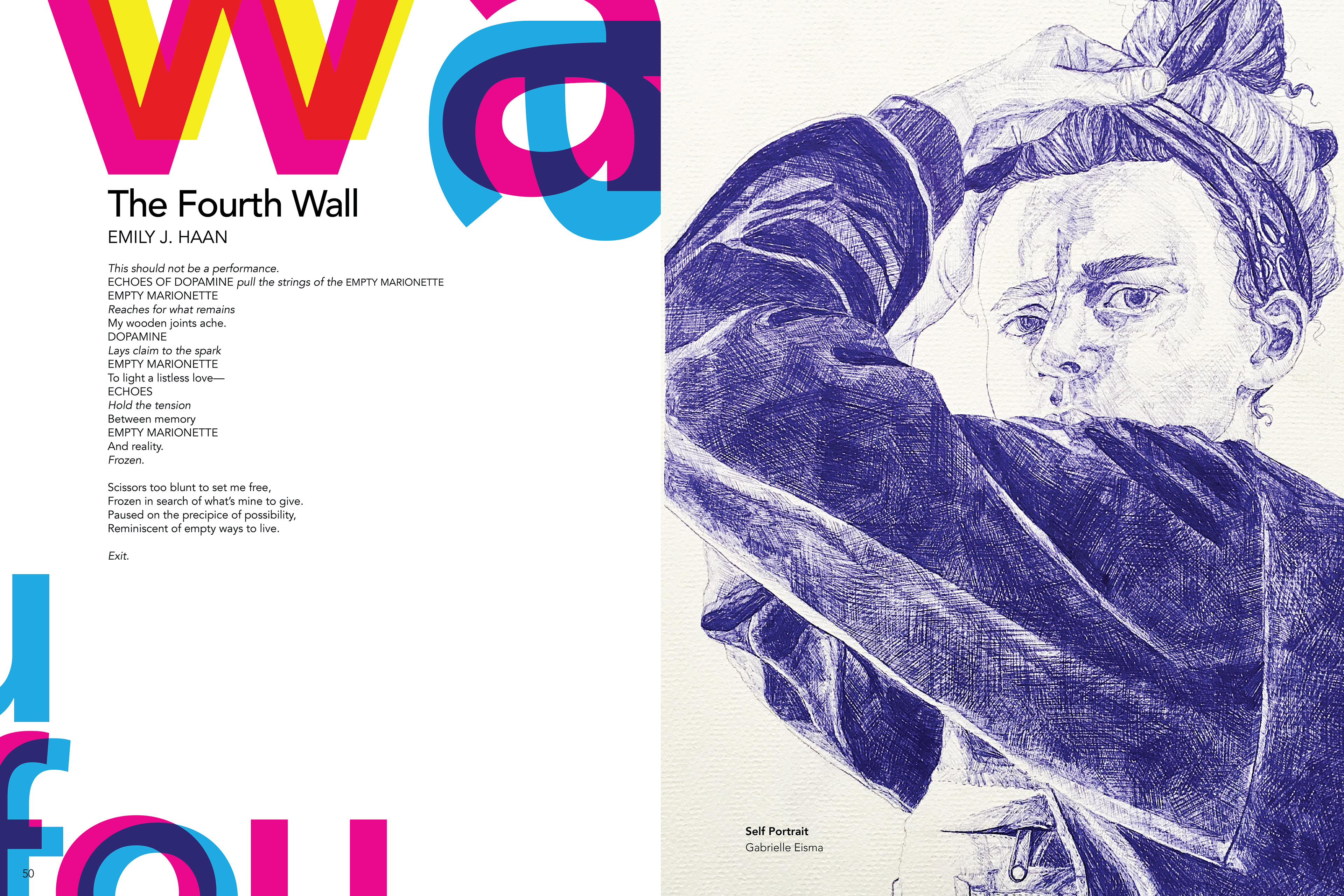
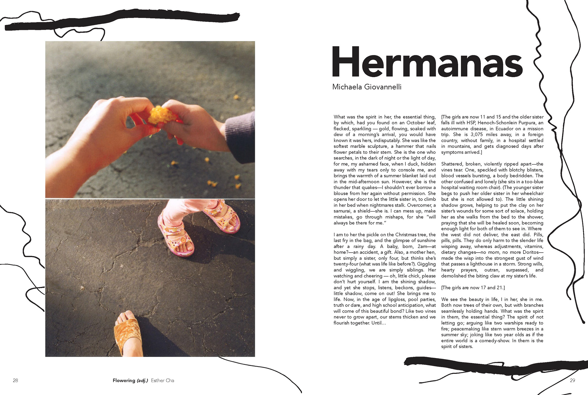
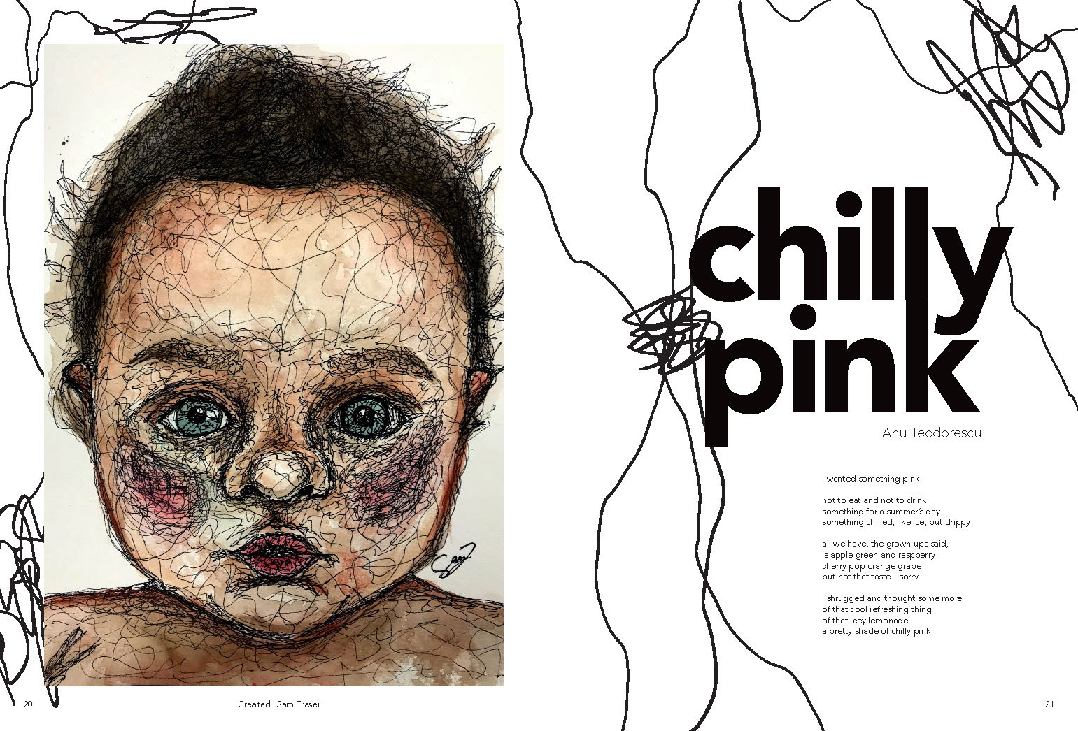
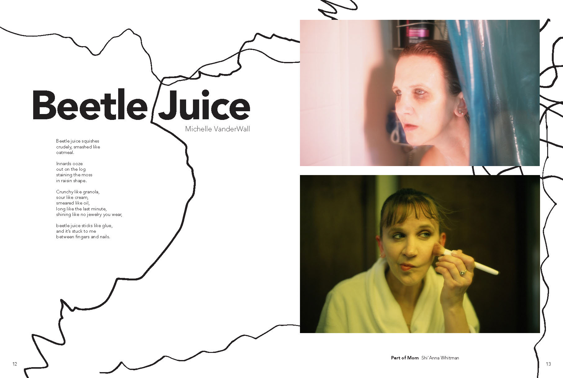
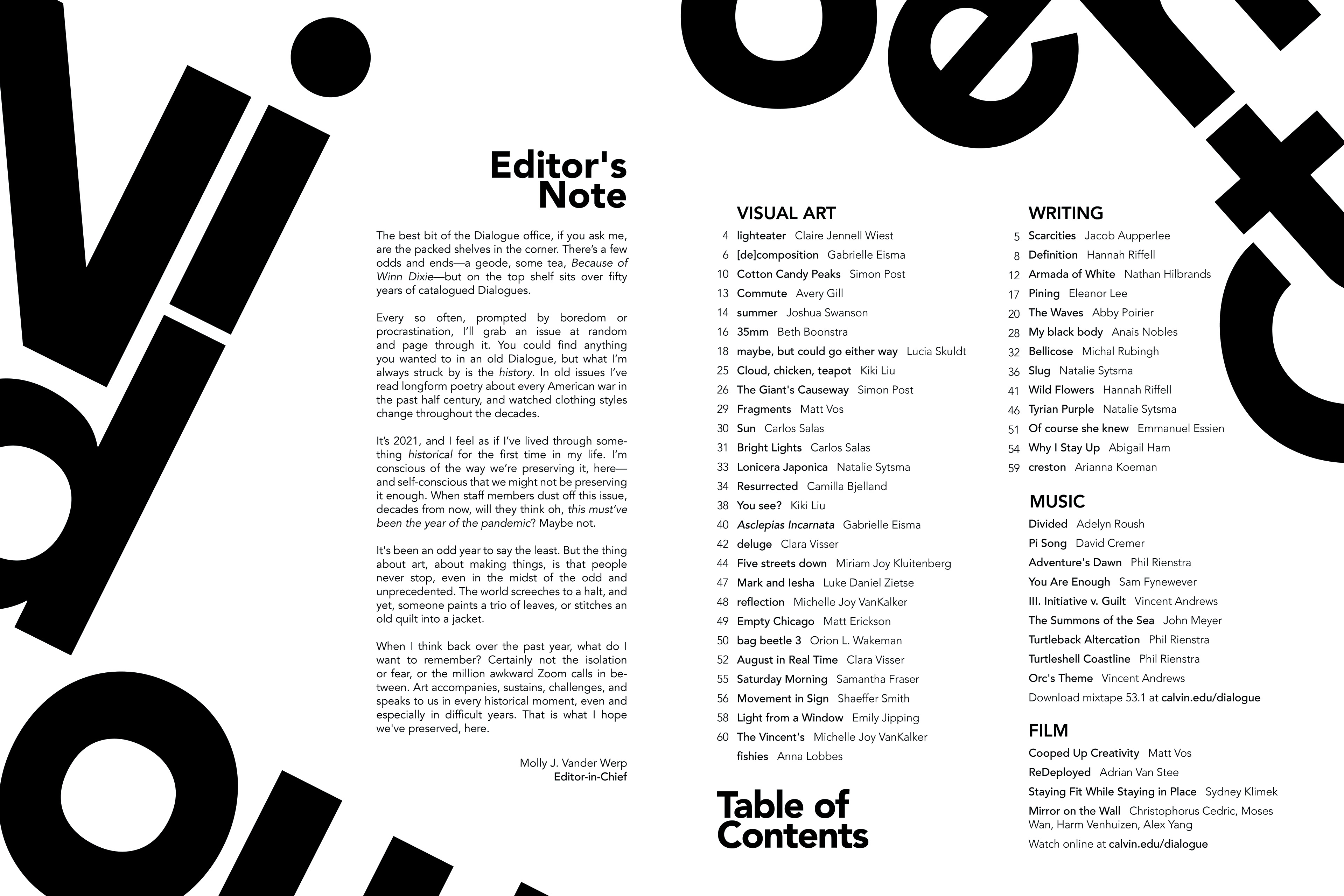
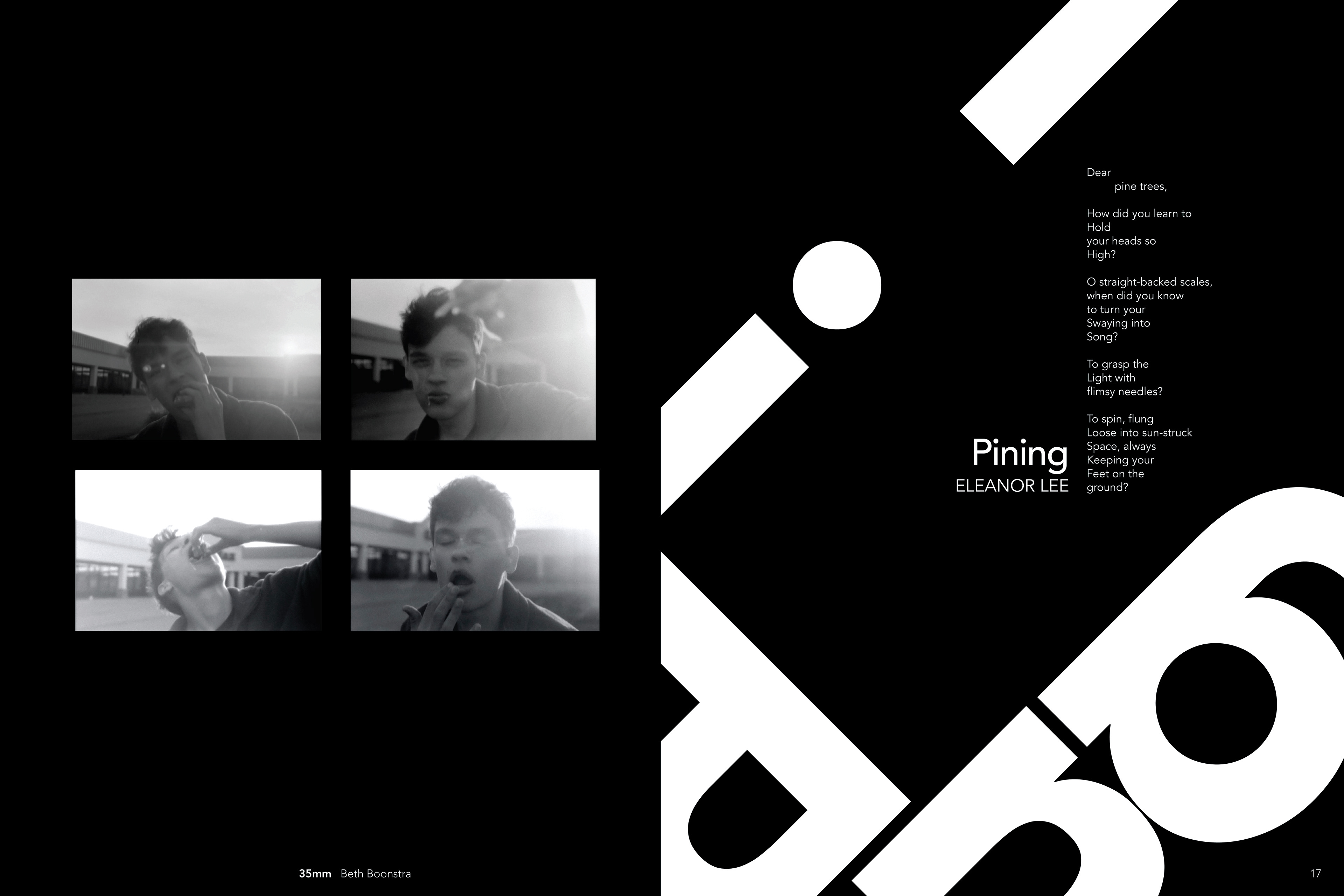
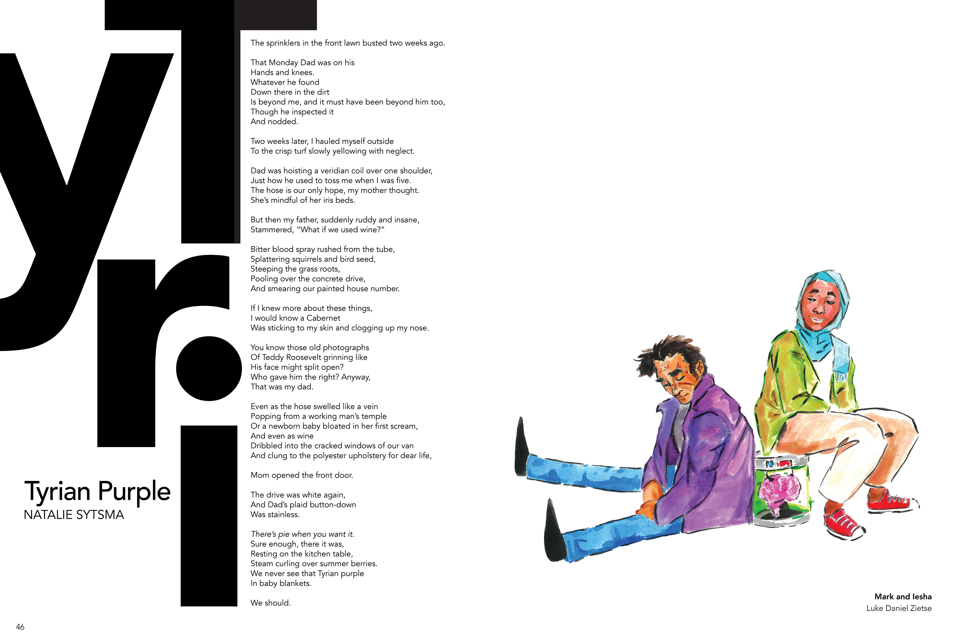
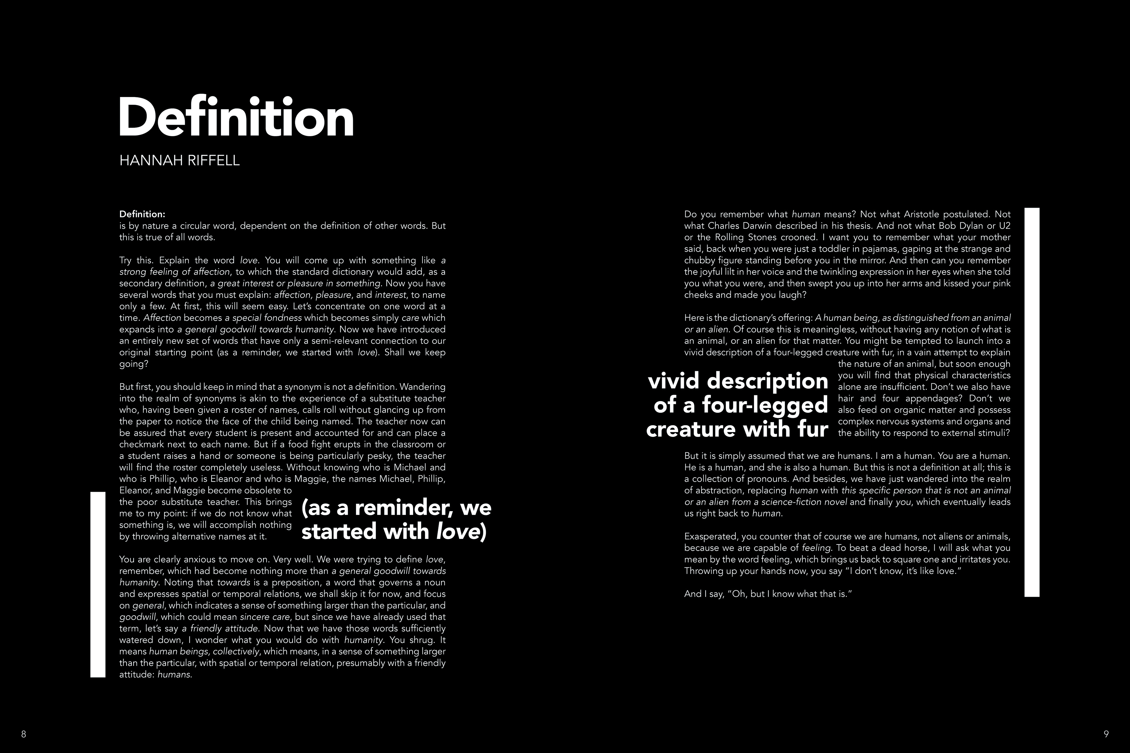
For issues, 53.1 + 2, I wanted to go bold with typography, focusing on the shapes of letters to accent the text and images in the journal. On top of that, I wanted to focus on the method of printing, and chose the first semester issue color palette to be black and white, with the second semester issue color palette being CMYK (reflected in their covers).
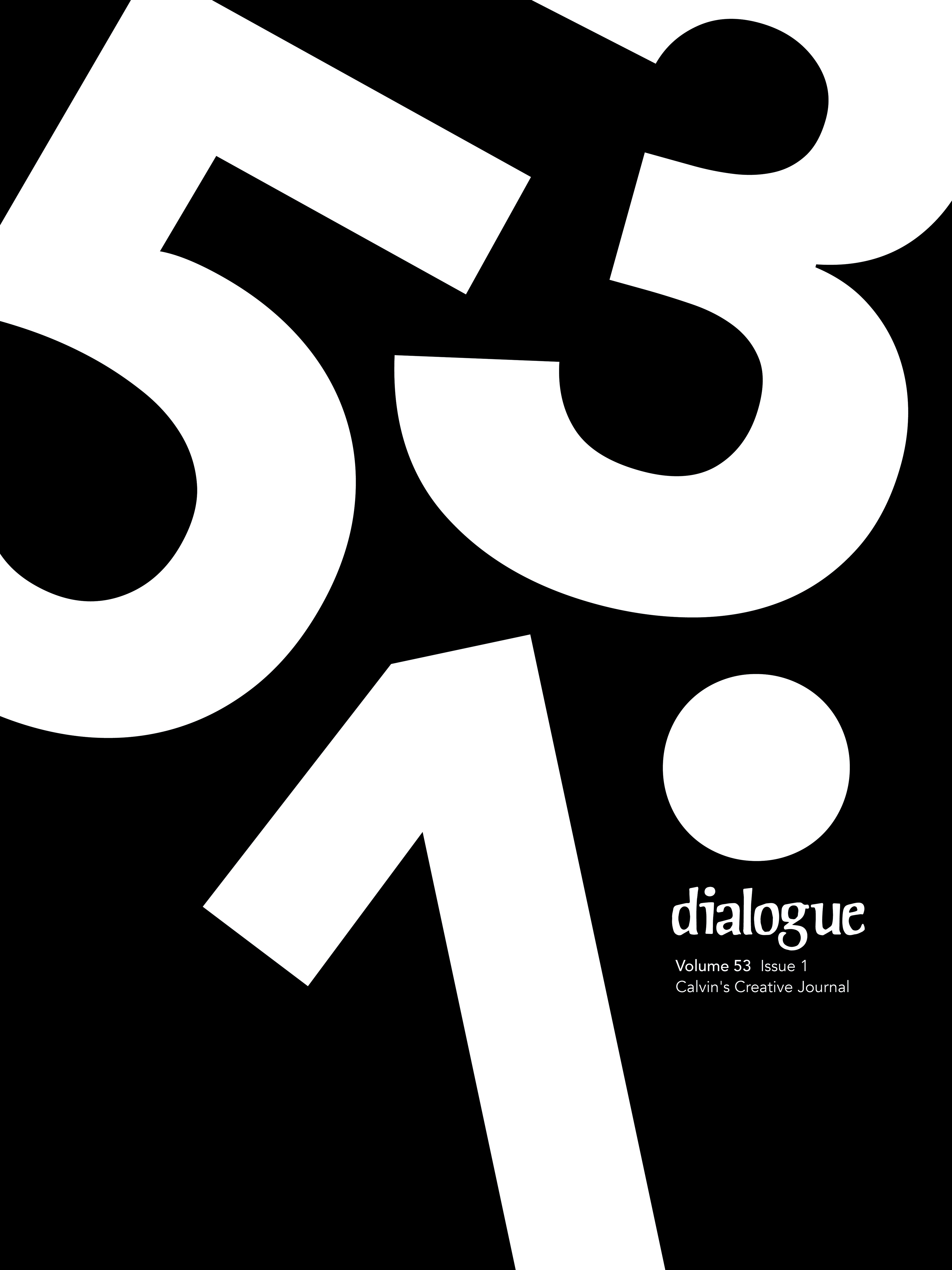

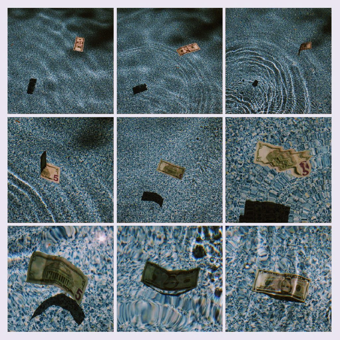
HERE ARE SOME SPREADS FROM 53.1
HERE ARE SOME SPREADS FROM 53.2